
The most common shape of a disappointing submission in this course is a technically clean one. The R code runs, the visualisation is labelled, the numbers are right, and the mark lands in the middle. What is missing is the sentence that says what the business should do differently, and why this evidence supports that. Data, Insights and Decisions puts the word insights in its title deliberately, and the gap between output and insight is where marks sit.
Author: MAAS Editorial Team
Last updated: 2026-08-10
Category: business-management

What is COMM1190 and where does it sit in the degree?
Direct answer: COMM1190 Data, Insights and Decisions is a 6-unit-of-credit undergraduate course in the UNSW Business School at the Kensington campus, offered in all three teaching terms. It builds on COMM1110 Evidence-based Problem Solving, teaching exploration, visualisation and predictive analytics on real business data using R, with emphasis on communicating findings to people who do not read code.
Evidence: These details come from the UNSW handbook entry and the university's own class timetable, which record the credit value, the faculty, the campus and the fact that the course runs in Term 1, Term 2 and Term 3. The timetable also shows the scale: a single term's lecture streams carry hundreds of students each.
Example: A student assumed a course running three times a year with a very large cohort must be an easy elective. The size has the opposite implication in practice. Large cohorts are marked by teams of tutors working from a shared rubric, so the rubric is applied consistently and there is little room for a marker to reward something the criteria do not mention.
That last point is the most useful thing to take from the enrolment numbers. In a course of this scale, the marking criteria are not a guide to the assessment. They are the assessment.
What do the learning outcomes actually ask for?
Direct answer: Four things, and only one of them is analysis. The published outcomes ask you to explain how an organisation uses analytical and statistical tools to gain insight, to apply statistics and data analysis to real datasets in order to make informed decisions, to visualise and analyse data in support of an argument, and to communicate insights and recommendations to a range of stakeholders.
Evidence: Read the third outcome closely: visualise and analyse data to support arguments. The chart is subordinate to the argument in the wording itself. A submission whose charts sit in a gallery, each correctly produced and none of them load-bearing, has inverted the relationship the outcome describes. The fourth outcome then makes the audience explicit, which means writing for a reader who wants a decision rather than a method.
Example: One report presented six visualisations, each accompanied by a sentence describing what it displayed. Asked which two she would keep if the client only had one page, the writer identified the two that changed what the client should do, and could not defend the other four. Cutting them made the argument visible for the first time.
What separates output from insight?
Direct answer: An insight names something the organisation did not already know, in a form specific enough to act on, with the evidence attached and the limits stated. Everything short of that is output.
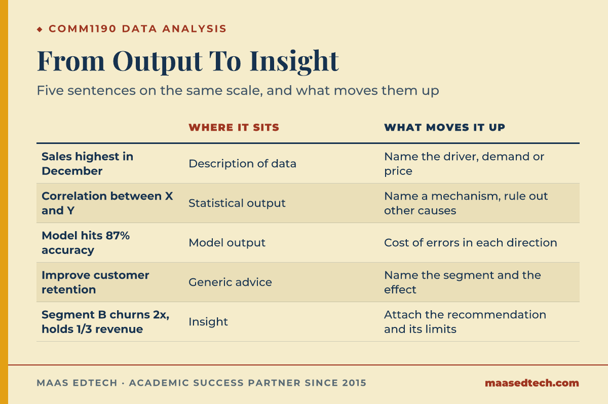
| What a submission says | Where it sits | What would move it up |
|---|---|---|
| "Sales are highest in December." | Description of the data | Which product lines drive it, and whether it is demand or discounting |
| "There is a correlation between X and Y." | Statistical output | What plausible mechanism links them, and what else could produce the same pattern |
| "The model achieves 87% accuracy." | Model output | What the errors cost when the model is wrong in each direction |
| "The company should improve customer retention." | Generic advice | Which segment, on what evidence, and what the expected effect is |
| "Segment B churns at twice the rate and accounts for a third of revenue." | Insight | Attach the recommendation and the uncertainty around it |
Evidence: The distinction between describing data and reasoning from it is the whole business of Exploratory Data Analysis, or EDA, which John Tukey (1977), a Princeton University statistician who also worked at Bell Labs, framed as looking for what the data suggest rather than confirming what you expected. On the presentation side, Edward Tufte (2001), a Yale University professor emeritus, argues in his book that visual design exists to serve the reasoning, so a chart that does not carry an argument is decoration regardless of how well it is drawn, a principle echoed in Leland Wilkinson's Grammar of Graphics (2005), first published by the statistician who had earlier built the SYSTAT software. Accuracy figures deserve the same scrutiny: on imbalanced business data, a high accuracy score can be produced by a model that never predicts the rare outcome anyone cares about, as Foster Provost, a New York University professor, and Tom Fawcett show in their book Data Science for Business (Provost & Fawcett, 2013), which is why a Confusion Matrix, and metrics such as AUC and Root Mean Squared Error, or RMSE, beyond a single accuracy number, tell a fuller story.
Example: A student reported strong model accuracy on a churn dataset and treated the result as settled. Because only a small share of customers churned, a model predicting that nobody churns would have scored nearly as well. Once she reported how many actual churners the model caught, the number fell sharply, and the analysis became honest and considerably more interesting.
How much does the R code itself matter?
Direct answer: Enough that it must run and be reproducible, and not enough to earn the top band on its own. Code is the instrument. The marks follow what you did with what it produced.
Evidence: The course teaches R, maintained by The R Foundation for Statistical Computing, because it is an open-source tool used on authentic datasets, not because programming skill is the object of assessment. Its most common interface, RStudio, was renamed Posit in 2022, and the packages students install typically come from the Comprehensive R Archive Network, or CRAN, the repository the same foundation maintains. Many student workflows follow the tidyverse conventions described by Wickham and Grolemund (2017), covering the same Extract, Transform, Load, or ETL, steps that sit behind most Business Intelligence, or BI, dashboards. Wickham and Grolemund make the point of the exercise explicit: "A good visualisation will show you things that you did not expect, or raise new questions about the data" (Wickham & Grolemund, 2017), which is the same standard the marker applies to a submission's charts. This has two practical consequences. Students with no coding background routinely overestimate how much of the mark is at risk from clumsy code, and students who arrive with programming experience routinely overinvest in elegant code while under-writing the interpretation. Both misread the same rubric in opposite directions.
Example: Two submissions used the same dataset. One contained neat, commented, efficient code and three paragraphs of interpretation. The other contained workmanlike code and two pages that explained what the pattern meant for the business, including where it might not hold. The second scored higher, and its author had been the more anxious of the two about her programming.
How should the written component be structured?
Direct answer: Lead with the finding, then justify it. Analytical work invites you to narrate your process chronologically, and that ordering buries the one sentence your reader needs.
A structure that works at first-year level: the decision or question you are addressing and why it matters, briefly; the headline finding stated plainly in one or two sentences; the evidence, meaning the visualisations and analysis that support it, with each element present because it does work; the recommendation, specific enough that someone could act on it this quarter; and the limitations, meaning what your data could not tell you and what would change your conclusion.
Evidence: The outcome about communicating to stakeholders is what makes the ordering matter. A business reader reads the first paragraph and skims the rest, so a report that reaches its finding on page four has communicated it to almost nobody. Note also that the limitations section is where first-year students most often lose easy marks, because acknowledging what your analysis cannot show reads as judgement rather than weakness.
Example: One report opened with data cleaning, moved to variable selection, then to modelling, and reached its recommendation in the final paragraph. The content was complete and the order was upside down. Moving the recommendation to the top and treating the process as supporting evidence produced the same document, read very differently.
Where do Vietnamese students most often lose marks?
Direct answer: In hedging without boundaries, and in writing that stays polite when the task asks for a position. Both are visible in the recommendation section, which is where a marker checks whether you can commit to a defensible claim.
Evidence: The outcome requires recommendations, and a recommendation that avoids saying what to do has not met it. The productive middle ground is a claim with its conditions attached: state the action, state the evidence it rests on, and state the circumstance that would make it wrong. That is not hedging, it is scope. If the action affects a tracked Key Performance Indicator, or KPI, name which one and connect the expected shift to Return on Investment, or ROI.
Example: A conclusion read that the company "may want to consider looking into improving its marketing in some segments." Rewritten, it recommended shifting spend towards the segment with the highest observed conversion, noted that the observation covered only two quarters, and flagged that a seasonal effect could account for part of it. The second version commits to something and is easier to defend, not harder.
A note on terminology: keep the English terms exact. Correlation, causation, accuracy, precision and recall have specific meanings, and a loose translation into everyday Vietnamese collapses distinctions the rubric is explicitly checking.
How should you prepare across the term?
Direct answer: Practise interpretation as deliberately as you practise code, because only one of the two is naturally rehearsed by doing the weekly work.
A pattern that works: each week, after finishing the technical exercise, write two sentences saying what a manager should do differently because of it. Keep those sentences somewhere; by mid-term you will have a stock of interpretations and a clear view of which ones were empty. Before the major assessment, take any chart you have produced and try to state its insight without describing it. If you cannot, the chart is not carrying an argument yet.
Evidence: Assessment structure and weightings vary by term and the authoritative source is your own course outline, published through the Business School before teaching begins. What does not vary is the rubric's interest in interpretation, since it is written into the learning outcomes rather than into a particular task.
What do MAAS mentors actually do on this course?
MAAS works as an academic advisor. The most useful session on a course like this one is usually short: you bring a chart or a model output, and a mentor asks what a manager should do differently because of it. If the answer takes more than a sentence, the analysis has not landed yet. From there the work is ordinary, meaning a read of your draft against the course criteria, a check on whether each visualisation is doing work, and attention to whether your recommendation is specific enough to act on. You write your own code and your own report and you submit your own work.
Frequently asked questions
How many units of credit is COMM1190, and when does it run?
Six units of credit, offered in all three UNSW teaching terms at the Kensington campus through the UNSW Business School, the same school that runs COMM1110.
Do I need programming experience?
No. The course teaches R, the practical skill behind most Business Intelligence, or BI, work, from the ground up as a tool for analysis. Students without a coding background usually overestimate how much of the mark depends on code quality.
What is the relationship with COMM1110?
COMM1190 builds directly on Evidence-based Problem Solving, which introduces basic statistical tools such as the Confusion Matrix and the role of evidence. If that material is shaky, revisit it early rather than during assessment week.
Is this a maths course?
No. It is a decision-making course that uses statistical tools such as AUC and RMSE. You need to interpret quantitative results correctly, which is a different demand from deriving them.
How is it assessed?
Tasks and weightings vary between terms, and your own course outline is the authority. Whatever the split, the learning outcomes make interpretation and communication assessable in every task.
My charts look basic. Will that cost me?
Far less than you think, even against the standard set by Edward Tufte and Leland Wilkinson. A plain chart that carries an argument outperforms an elaborate one that does not, and elaboration for its own sake works against the clarity the outcomes ask for.
Related reading
- ISYS3453: data analytics assignment guide
- How to write a university report
- Data and coding project support from MAAS
Talk to a MAAS mentor about your course
References
Provost, F., & Fawcett, T. (2013). Data science for business: What you need to know about data mining and data-analytic thinking. O'Reilly Media.
Tufte, E. R. (2001). The visual display of quantitative information (2nd ed.). Graphics Press.
Tukey, J. W. (1977). Exploratory data analysis. Addison-Wesley.
Wickham, H., & Grolemund, G. (2017). R for data science: Import, tidy, transform, visualize, and model data. O'Reilly Media.
Wilkinson, L. (2005). The grammar of graphics (2nd ed.). Springer.