
◆ IT & Data
INFO3315: why doesn't your opinion about the interface count as evidence?
INFO3315 Human-Computer Interaction at the University of Sydney sits in a faculty where correctness is usually decidable: code compiles or it does not, a test passes or it fails. Then a unit arrives where the central question is whether an interface works for people, and habits built over two years of programming units stop working. A marker's most common note is that the claim about the design has nothing behind it except the student's own reaction to it.
◆ Question 1 / 8 · The unit
What is INFO3315 and where does it sit?
Direct answer: INFO3315 Human-Computer Interaction is a 6 credit point unit in the Faculty of Engineering at the University of Sydney, designed as a first subject in HCI. Half the mark is a final exam with a pass hurdle. It covers human foundations from psychology and physiology, HCI design and evaluation methods, and emerging interaction technology, anchored by a human-centred group project.
Evidence: The methods themselves have a longer history than the unit outline suggests. Card, Moran and Newell (1983) developed the GOMS model at Xerox PARC specifically to predict how long an expert user would take to complete a task, long before anyone called this field human-computer interaction. That prerequisite structure is the whole design of the unit in miniature. The faculty is not teaching you to program; you arrive able to do that. What is being added is a discipline for deciding what to build and for showing that the decision was sound, which draws on psychology both for theory and for user study methods. Norman (2013), in The Design of Everyday Things, is where most students first meet the idea of an affordance, a property of an object that suggests how it can be used, and the related idea of a signifier, the visible cue that communicates that property. Norman defines the first term precisely: "An affordance is a relationship between the properties of an object and the capabilities of the agent that determine just how the object could possibly be used" (Norman, 2013, p. 10). Low-fidelity prototypes built in a tool such as Adobe XD or Figma exist to test exactly that: whether the signifiers you designed actually communicate the affordances you intended.
Example: A Vietnamese student in the advanced computing stream described the unit to a MAAS mentor as "the soft one". By week five he had a working prototype and a report that could not survive a single question about why any of it was arranged the way it was. The building was never the hard part of this unit, and treating it as the hard part is how students end up with a polished artefact and a mid-range mark.
◆ Question 2 / 8 · What it asks for
What is the unit actually asking you to produce?
Direct answer: Evidence-based conclusions about an interface, at least as much as the interface itself. Of the eight published learning outcomes, two concern making something, namely applying standard design approaches and using a prototyping tool to build low-fidelity prototypes. The other six concern selecting techniques for establishing user groups and their requirements, evaluating interfaces using both discount and user-based techniques, explaining how human factors influence design, demonstrating knowledge of the main design and evaluation methods, demonstrating knowledge of a broad range of interfaces, and presenting the design and evaluation of a prototype. The ratio is the point: building is one activity among several, and it is the one students overweight. The unit's own shape roughly tracks what the Design Council calls the Double Diamond, diverging to understand the problem before converging on a definition, then diverging again on solutions before converging on a build.
| What students optimise | What the outcomes reward | Consequence at marking |
|---|---|---|
| A polished, working prototype | A low-fidelity prototype that answered a question | Effort spent where no marks live |
| A design they find intuitive | A design traced to a defined user group | "Who is this for?" left unanswered |
| A long list of features | Usability requirements with a source | Requirements that appeared from nowhere |
| A confident recommendation | A conclusion with its evidence attached | Assertion read as opinion |
Evidence: In practice, a discount round often means a Heuristic Evaluation or a Cognitive Walkthrough conducted by two or three reviewers, while a user-based round means putting the prototype in front of people who are not on the project team. Low-fidelity prototyping is specified deliberately rather than as a concession to time. A rough prototype is cheap enough to throw away, which is what makes it usable as an instrument for testing an idea. A polished one invites its maker to defend it, and the unit is trying to train the opposite instinct.
Example: Two groups submitted work on the same brief. One spent three weeks building a functioning interface and evaluated it once at the end. The other built three rough versions, tested each on a handful of people, and submitted the third with an account of what the first two had got wrong. The second group's artefact looked worse in every screenshot and marked considerably higher, because the report had something to say.
◆ Question 3 / 8 · Evaluation
What is the difference between discount and user-based evaluation?
Direct answer: They answer different questions, and using one to answer the other's question is the most reliable way to lose marks in this unit. Discount methods, such as expert inspection against a set of usability principles or an accessibility standard like WCAG, are fast and cheap and tell you where an interface probably violates known good practice.
User-based methods put real people in front of the thing and tell you what actually happens. An expert walkthrough cannot tell you that users never noticed a button; only users can. A user study cannot efficiently tell you that your error messages breach a well-established principle; an inspection can.
Evidence: The discount usability tradition was developed explicitly as an engineering compromise, a position Jakob Nielsen (1994) argued directly, on the grounds that a cheap method finding most of the serious problems beats a rigorous method that never gets run because it costs too much. That framing matters for your report: discount methods are defensible precisely because of what they give up, and a report that presents inspection findings as though they were observed user behaviour has misdescribed its own evidence. The international standard ISO 9241 frames usability itself around effectiveness, efficiency and satisfaction, which is a useful checklist when you are deciding what your own evaluation should actually measure. Ben Shneiderman, long based at the University of Maryland, set out Eight Golden Rules of Interface Design that remain a common cross-check for a discount round, even when the unit itself never lists them by name. A user-based round can be as simple as a short System Usability Scale (SUS) questionnaire administered after each task, alongside the observation notes.
Example: A group's report claimed their navigation was confusing for first-time users. The claim was true, as it happened. It was also drawn entirely from a heuristic inspection the team had run themselves, with no first-time user involved anywhere in the study. Relabelling the finding as a predicted problem, and adding two sentences on how they would test it, cost nothing and turned an overreach into a correctly scoped claim.
◆ Question 4 / 8 · User groups
How do you define a user group without inventing one?
Direct answer: Ground it in something outside your own head. A user group defined as "university students aged 18 to 25 who are busy" is not a finding; it is a description of the people who happen to be in your project team.
Alan Cooper popularised the persona as a design tool in his 1999 book The Inmates Are Running the Asylum, an idea he later expanded in About Face, precisely to stop designers building for an audience of one, themselves. A defensible user group comes with characteristics that matter for the interface, a reason to believe those characteristics hold, and an account of what follows for the design. Requirements-gathering techniques such as Card Sorting or a short Contextual Inquiry session exist to pull that description from somewhere outside your own head. If nothing in your design would change had you defined the group differently, the definition is not doing any work.
Evidence: Dix, Finlay, Abowd and Beale (2004), in the widely used textbook Human-Computer Interaction, treat the human and the computer as two connected topics before ever reaching interaction design, which is the same ordering the unit imposes on your own report. The unit lists the identification of user groups and usability requirements as its first outcome, ahead of design and evaluation, which reflects the ordering in practice. Requirements that cannot be traced back to a described population are unfalsifiable, and an unfalsifiable requirement cannot be evaluated against, which quietly breaks every later stage of the report.
Example: One team defined their users as people with limited technical confidence, then designed an interface with a hidden gesture-based shortcut as the primary navigation. Nobody on the team noticed the contradiction until a mentor read the two sections next to each other. The fix was not more work; it was the realisation that a user group definition is a constraint you have imposed on yourself, and not a paragraph at the front.
◆ Question 5 / 8 · Group project
What makes group project work go wrong here?
Direct answer: Division of labour by section rather than by question. When one person owns the user research, another owns the prototype and a third owns the evaluation, the three parts stop referring to each other, and the report reads as three documents stapled together. The evaluation ends up testing things the requirements never asked about, and the prototype embodies decisions the research never supported. Marking criteria that reward evidence-based conclusions punish this severely, because the chain from user group to requirement to design to evidence is exactly what breaks.
Evidence: The project is described as human-centred, which is a claim about process rather than about subject matter. Preece, Sharp and Rogers (2019) describe the interaction design cycle as inherently iterative, which is exactly the property a team that divides the work by section removes. A human-centred process is iterative by definition: what you learn from evaluating one version changes the next. A team structure that hands the evaluation to one person at the end has removed the iteration while keeping the name.
Example: In one group, the evaluation section reported a usability problem in a feature that had been cut from the prototype two weeks earlier. Nobody had lied and nobody had been lazy. The sections had simply been written in parallel by people who had stopped talking, and the report documented a version of the system that no longer existed.
◆ Question 6 / 8 · Findings
How should you write up findings so they read as evidence?
Direct answer: State the method, the participants, what was observed, and only then what you conclude, in that order, and keep the conclusion narrower than the observation. The seven-stage model of action set out by Norman (2013), from forming a goal through to evaluating the outcome, is a useful checklist for making sure a write-up reports what happened at each stage rather than jumping straight to a verdict. Most weak write-ups invert this, leading with a confident claim and mentioning the method afterwards as background. The inversion reads as opinion looking for support. Keeping the four elements in order also makes your own overreach visible to you while there is still time to fix it.
Evidence: Preece, Sharp and Rogers (2019) set out interaction design as a cycle of establishing requirements, designing alternatives, building prototypes and evaluating them, and a written report that follows that same order is easier for a marker to check than one that jumps straight to a verdict. Presenting a design with evidence-based conclusions about its strengths and weaknesses is a named outcome of the unit, and the phrase carries two requirements rather than one. Conclusions must exist, and they must be attached to evidence. A report full of observations with no conclusion fails the first; a report full of conclusions with no observations fails the second, and the second is far more common in a cohort trained to sound decisive.
Example: A student wrote that the redesigned form "significantly improved" completion. Asked what significantly meant here, he explained that four of five testers finished faster. That is a real result and worth reporting, but it is not significance in any technical sense, and using the word invited a challenge his data could not meet. Writing what actually happened, in plain terms, was both more honest and better received.
◆ Question 7 / 8 · Emerging tech
How should Vietnamese students approach the emerging technologies component?
Direct answer: Treat it as an analysis task rather than a survey. The unit covers newer interface types, including social, natural user interface (NUI), emotion-aware and ubiquitous interaction, and the temptation is to describe each in turn. The term itself goes back to Mark Weiser, who coined "ubiquitous computing" in 1991 to describe technology that recedes into the background of everyday life, and the emotion-aware strand descends from what Rosalind Picard's 1997 book called Affective Computing. Knowing where a term came from is not the point of the analysis, but it stops you writing a definition as though it were an insight. What earns marks is applying the same analytical apparatus you used on your own project: who is the user group, what human factors are engaged, how would you evaluate it, and where does it fail. A paragraph that says what an emotion-aware interface is contains no argument. A paragraph that says what would be hard to evaluate about one does.
Evidence: The relevant outcome asks students to analyse emerging interface types, and analysis in this context means locating the design tensions rather than cataloguing the features. Newer interaction paradigms tend to raise exactly the difficulties the earlier parts of the unit trained you to notice, particularly around consent, error recovery and the visibility of system state.
Example: Asked to discuss ubiquitous computing, one student wrote four paragraphs of description and one sentence of evaluation. Reversing that ratio required no new reading at all. The single question that unlocked it was how a user would even know an interaction had failed when the interface has no screen.
◆ Question 8 / 8 · The exam
Where does the exam fit, and why does it change your planning?
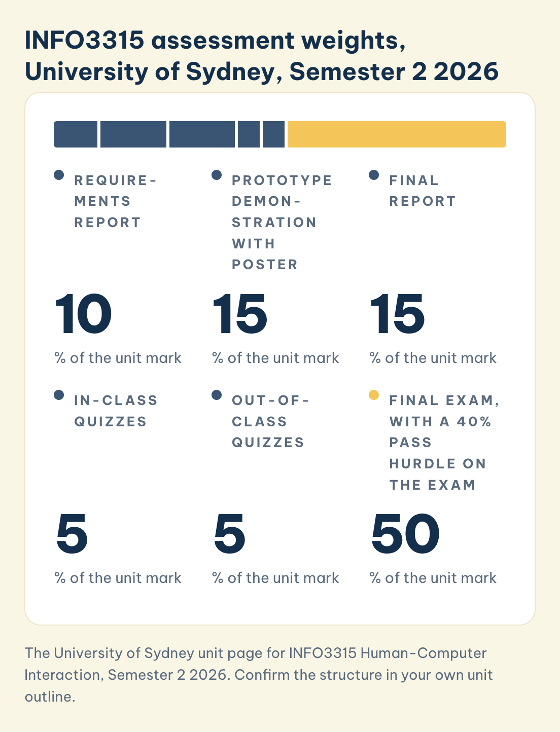
Direct answer: In Semester 2 2026 the group project is worth 40% in total, split across a requirements report worth 10%, a prototype demonstration with poster worth 15%, and a final report worth 15%. In-class quizzes carry 5% and out-of-class quizzes another 5%. The final exam carries 50%.
INFO3315 assessment weights, University of Sydney, Semester 2 2026
Each part is one assessed item, and the six parts add up to 100%.
Requirements report
10
% of the unit mark
Prototype demonstration with poster
15
% of the unit mark
Final report
15
% of the unit mark
In-class quizzes
5
% of the unit mark
Out-of-class quizzes
5
% of the unit mark
Final exam, with a 40% pass hurdle on the exam
50
% of the unit mark
Save this figure
To pass you must score at least 40% on that exam, reach 50 overall, and clear a second hurdle that carries no marks at all: the weekly group journal of meeting minutes, which is worth 0% but must still be completed. Confirm the structure in your own University of Sydney unit outline, but plan on the assumption that the project cannot carry you.
Evidence: A hurdle changes the arithmetic in a way weighting alone does not. A student who scores well across every project component and 35% on the exam does not pass, regardless of the total. That makes exam preparation a precondition rather than one input among several, and it sits awkwardly with the way project work absorbs attention in the final weeks of semester.
Example: A group that had produced genuinely good project work spent the last fortnight polishing the final report, on the reasoning that it was the piece they could still improve. It was also worth 15%. The exam they were not revising for was worth 50% and carried the hurdle, and one member of that group repeated the unit.
Frequently asked questions
Do I need design experience to take INFO3315?
No. The prerequisites set by the Faculty of Engineering are programming and advanced-computing units rather than design ones, and the unit teaches design method from the ground up. What surprises most students is not the design work but the shift from provable correctness to evidence and judgement.
Does the prototype need to be functional?
The unit specifies low-fidelity prototyping, and a rough prototype that tests a question is worth more than a polished one that tests nothing. Check your own assignment brief for what is required, but do not assume that more build effort translates into more marks.
How many participants does a user study need at this level?
Fewer than students expect, and what matters far more is that you report honestly what you did. A study with five participants, described accurately, is stronger than a study with twenty described vaguely.
Can I evaluate my own interface?
You can inspect it against usability principles, a discount method Nielsen (1994) himself defended on cost grounds, but you cannot substitute that for user-based evaluation and you should never describe your own inspection findings as user behaviour. The distinction between the two is itself examinable.
Can MAAS help me with INFO3315?
Yes. MAAS Academic Support coaches University of Sydney students through the unit with the Outline → Draft → Final model, including user group definition, choosing an evaluation method that fits your question, and write-up feedback with mentors from a human-computer interaction background. We coach your work; we do not write it for you.
Ready to make your INFO3315 claims stand up?
If your prototype is good and your University of Sydney report still comes back marked as unsupported, the gap is between what you know and what you have shown, and that gap is closeable. MAAS Academic Support works alongside you through Outline → Draft → Final so the design stays yours while the evidence behind it becomes visible. Every engagement for University of Sydney students sets a three-tier target grade with you at the start (Pass, Merit or Distinction) and 45 days of follow-up support after submission.
Bring your University of Sydney INFO3315 project brief and we will match you to an interaction design expert within 48 hours. Within our network of 100+ experts, 23% hold a PhD.
Book a free 20-minute INFO3315 consultation with MAAS Academic Support →
Related guides
- INFO5995 Introduction to Cybersecurity assignment guide: another Sydney computing unit where the argument matters as much as the technique
- 7COM1025 Programming for Software Engineers assignment guide: a computing unit assessed on engineering judgement rather than working code alone
- ISYS90026 Concepts of Information Systems assignment guide: systems thinking where people and technology meet
- MAAS Academic Mentoring service: 1:1 coaching with PhD-level mentors in your discipline
- Course-code assignment coaching: pillar guide on tackling any unit assignment with a MAAS mentor
References
- Card, S. K., Moran, T. P., & Newell, A. (1983). The psychology of human-computer interaction. Lawrence Erlbaum Associates.
- Dix, A., Finlay, J., Abowd, G. D., & Beale, R. (2004). Human-computer interaction (3rd ed.). Pearson Prentice Hall.
- Nielsen, J. (1994). Usability inspection methods. In Conference companion on human factors in computing systems (pp. 413–414). Association for Computing Machinery. https://doi.org/10.1145/259963.260531
- Norman, D. A. (2013). The design of everyday things (Rev. ed.). Basic Books.
- Preece, J., Sharp, H., & Rogers, Y. (2019). Interaction design: Beyond human-computer interaction (5th ed.). Wiley.
Tools & resources
- The University of Sydney. (n.d.). INFO3315 Human-Computer Interaction. Retrieved August 20, 2026, from https://www.sydney.edu.au/units/INFO3315
- The University of Sydney Library. (n.d.). Referencing and citation styles. Retrieved August 20, 2026, from https://www.library.sydney.edu.au/support/referencing
This article is part of the MAAS Journal series for Vietnamese international students. MAAS Academic Support is an advisory partner; we coach students through the Outline → Draft → Final delivery model with developmental feedback from discipline-matched experts. We do not write or submit work on a student's behalf.
A free 20-minute consultation is a conversation about where you are with INFO3315.
Book a free consultation ▸