
This course asks you to combine data, a visualisation and a narrative into something powerful enough to drive change. That is a useful skill, and it sits one step from a serious problem: the same techniques that make a chart persuasive can also make it misleading, and the line between them is not marked. Treating the course as a software unit, learning R and Tableau, produces competent work; treating persuasion as an obligation produces defensible work.
Author: MAAS Editorial Team
Last updated: 2026-08-12
Category: communication-pr

What is the course, and what does it actually cover?
Direct answer: At UNSW, COMM2501 is Data Visualisation and Communication, a 6 unit of credit undergraduate course in the Business School, introducing statistical and visualisation tools for exploratory data analysis and building interactive visualisations in R and Tableau, with a stated focus on data storytelling, combining data, visualisation and narrative into a story that drives change.
Evidence: The course description opens by naming the problem it exists to solve: businesses generate enormous quantities of data, and the ability to give visual access to it is an essential analyst skill. Note the framing. Visualisation is presented as an access problem, not a decoration problem. The chart is the interface between a dataset and a decision.
Example: A student produced a dashboard with twelve charts covering everything in the dataset. It was thorough and nobody could use it. The revision showed three charts answering one question, and the analyst had made a judgement about what mattered rather than deferring it to the reader, the same discipline Few (2006) prescribes for dashboards and Knaflic (2015) prescribes for slides.
Why does "effective" have a technical meaning here?
Direct answer: Because effectiveness in visualisation has been studied experimentally rather than left to taste. There is a measured ordering of how accurately people extract quantitative information from different visual encodings, and it gives you a defensible reason to choose one chart over another.
Evidence: Cleveland and McGill (1984) set out to give graphical methods a scientific foundation, identifying a set of elementary perceptual tasks people perform when reading quantitative information off a graph and then ordering those tasks by how accurately people perform them. Their design principle follows directly: graphs should use tasks as high in that ordering as possible. Applying it, they concluded that popular forms including pie charts and divided bar charts needed what they called radical surgery, because a pie chart asks the reader to judge angles when the same data can always be shown on a common scale where the reader judges position instead.
The chart types on trial in this course predate computers by two centuries. William Playfair is usually credited with introducing the bar chart and the line graph in 1786, and the pie chart in 1801, in work historians of statistical graphics treat as the origin of the field. Cleveland and McGill (1984) tested exactly those forms and found the newest of the three, the pie chart, the least accurate for the comparison task it is normally used for.
Munzner (2014) organises this literature into a broader framework in Visualization Analysis and Design, published by CRC Press, arguing that encoding choice should follow task analysis rather than habit. Ware (2013) extends the same idea into perception science more broadly in Information Visualization: Perception for Design, published by Morgan Kaufmann, arguing that a designer who understands how the visual system works can predict which encodings will fail before a single reader sees the chart. The IEEE Transactions on Visualization and Computer Graphics remains one of the main venues where these perceptual rankings continue to get tested and revised, alongside IEEE's VIS conference, the discipline's flagship research venue.
Example: Asked why she replaced a pie chart with a dot chart, a weaker answer said pie charts are considered outdated. A stronger one said the data was a set of parts of a whole that could be placed on a common scale, that judging position along a common scale is more accurate than judging angle, and that the ordering of the five categories was unreadable in the pie and immediate in the dot chart. Same decision, and only one of them is an argument, the difference between citing a rule and applying Cleveland and McGill (1984) directly to your own five categories.
Where is the ethical line in data storytelling?
Direct answer: It sits at the point where the narrative starts selecting the evidence rather than following it. Storytelling asks you to have a point. It does not license you to arrange the data until it makes that point.
Evidence: Distortion is not hypothetical, and its effects have been measured. Pandey et al. (2015) ran an empirical analysis of common distortion techniques in visualisation, testing whether familiar manipulations actually change what readers conclude. The finding that matters for your assignments is that they do. A truncated axis, an inverted scale or a manipulated aspect ratio are not stylistic quirks that sophisticated readers automatically discount. They shift judgements.
Huff (1954) made a similar point decades earlier, and Tufte (1983) later formalised it in The Visual Display of Quantitative Information as a lie factor, the ratio between the size of an effect shown in a graphic and the size of the effect in the underlying data. Both arguments predate interactive dashboards, and both still hold. The Pandey et al. study itself appeared at ACM's CHI conference, the field's main venue for testing how readers actually respond to a chart rather than how a designer intends it to be read.
Cairo (2019) catalogues the same problem from the reader's side in How Charts Lie, listing truncated axes, dual axes and cherry-picked time windows as techniques that turn an accurate dataset into a misleading chart without a single number in it being false.
That result cuts both ways, which is why it belongs in a storytelling course rather than only in an ethics one. If distortion works, then every design choice you make is a choice about how much the reader will believe, and you cannot claim neutrality for a decision you made deliberately.
Example: A student building a case about rising costs truncated the y-axis, which made a modest increase look dramatic. Challenged, she said the trend was real. It was. The revised chart kept the full axis, and she made the case in the annotation instead, pointing out that a 4% rise on that base was material given the margin. The argument survived; it just moved from the axis to the sentence, where it could be checked.
What does the exploratory stage owe the final chart?
Direct answer: An honest account of what you removed. Exploratory analysis always involves decisions about missing values, outliers and time ranges, and those decisions shape the chart far more than the colour palette does.
Evidence: The course sequence puts exploration before communication for a reason. By the time you produce a final visualisation you have already chosen which rows to keep, how to treat gaps, and where the series starts and ends. A reader seeing only the finished chart cannot see any of that, which means the obligation to disclose sits with you rather than with them. This is the same principle as the axis question, applied earlier in the pipeline.
Segel and Heer (2010) traced how professional data journalism blends exploratory charts with narrative structure, and Bertin (1967) had already argued decades earlier that a graphic exists to answer a question, not to store data. Both readings support the same rule taught in this course, that the exploratory chart and the final chart serve different readers.
Example: A student excluded two outlier months as data errors and the trend became clean and convincing. When a tutor asked what had happened in those months, it turned out one was a genuine shock the story needed to explain rather than remove. The final version kept both points, annotated the shock, and made a stronger claim because it accounted for the thing that did not fit, the same disclosure Segel and Heer (2010) and Bertin (1967) both treat as the price of exploring before you communicate.
What separates a data story from a report?
Direct answer: A report covers the dataset and labels axes; a data story answers one question, selects charts that carry the argument, and addresses the strongest opposing reading. Few (2006) and Kosara and Mackinlay (2013) both frame this as the difference between something explored like a report and something read at a glance.
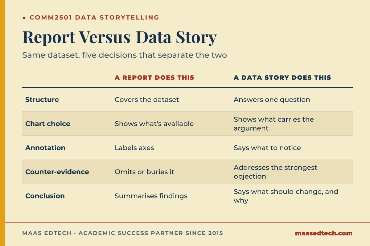
| Element | A report does this | A data story does this |
|---|---|---|
| Structure | Covers the dataset | Answers one question |
| Chart selection | Shows what is available | Shows what carries the argument |
| Annotation | Labels axes | States what the reader should notice |
| Counter-evidence | Omits or buries it | Addresses the strongest opposing reading |
| Conclusion | Summarises findings | Says what should change and on what basis |
Evidence: The course description names the goal as a story powerful enough to drive change, which means the deliverable is judged as an argument. An argument that has not met its strongest objection is incomplete regardless of how well it is rendered.
Few (2006) makes a related distinction for business dashboards in Information Dashboard Design, arguing that a dashboard should be readable at a glance rather than explored like a report. Kosara and Mackinlay (2013) extend the same argument to storytelling directly, in an article titled The Next Step for Visualization, published in the IEEE journal Computer.
Knaflic (2015) reaches a similar conclusion, insisting that a chart earns its place in a business deck only once it delivers what she calls the big idea, a single sentence a reader could repeat back correctly. Yau (2011) makes the same point from a different angle in Visualize This, treating a finished chart as an argument for which one relationship in the data matters enough to show, not an inventory of everything that could be shown.
Example: Two projects examined the same productivity dataset. The first presented the trend and concluded that productivity was the problem. The second presented the same trend, acknowledged the competing reading that focuses on job quality and underemployment, explained which parts of the data distinguish the two, and then argued for its conclusion. The second is the one that would survive a question from someone who disagreed.
How much should the tooling matter?
Direct answer: Less than students expect, and it should be invisible in the final work. R and Tableau are how you produce the artefact. Nothing about your grade depends on the reader being able to tell how hard it was.
Evidence: The course positions the tools inside a sequence that starts with exploratory analysis and ends with communication. Exploration is where the tool earns its keep, because that is where you are finding out what is in the data. By the time you are communicating, the question is whether the chart is the right chart, and that question has the same answer whichever software drew it.
Both tools trace back to real research rather than arbitrary defaults. Wilkinson (2005) set out a grammar of graphics in a book of the same name, describing a chart as a combination of data, geometry and scale rather than a fixed template, and Wickham (2010) adapted that grammar for R in a paper published in the Journal of Computational and Graphical Statistics, the theory ggplot2 in R still follows. Tableau has a similar origin: Stolte, Tang and Hanrahan (2002) described Polaris, a Stanford University research system for querying and visualising multidimensional data, in IEEE Transactions on Visualization and Computer Graphics, and Polaris became the basis for the commercial product. None of this raises a mark on its own, but it explains why R and Tableau keep steering you toward the same encodings Cleveland and McGill described in 1984.
Example: A student spent most of a project week building an interactive visualisation with linked filters. It worked, and no reader ever changed a filter. A static chart with a clear annotation would have carried the same insight, and the week would have gone into checking whether the insight was right.
A practical order of work
Direct answer: Write the question before opening the data, explore separately and keep exploratory charts out of the final piece, then choose encodings by perceptual task rather than variety. Write the annotation before finalising the chart, draw the honest version first even if the effect shrinks, and name the strongest opposing reading of your data.
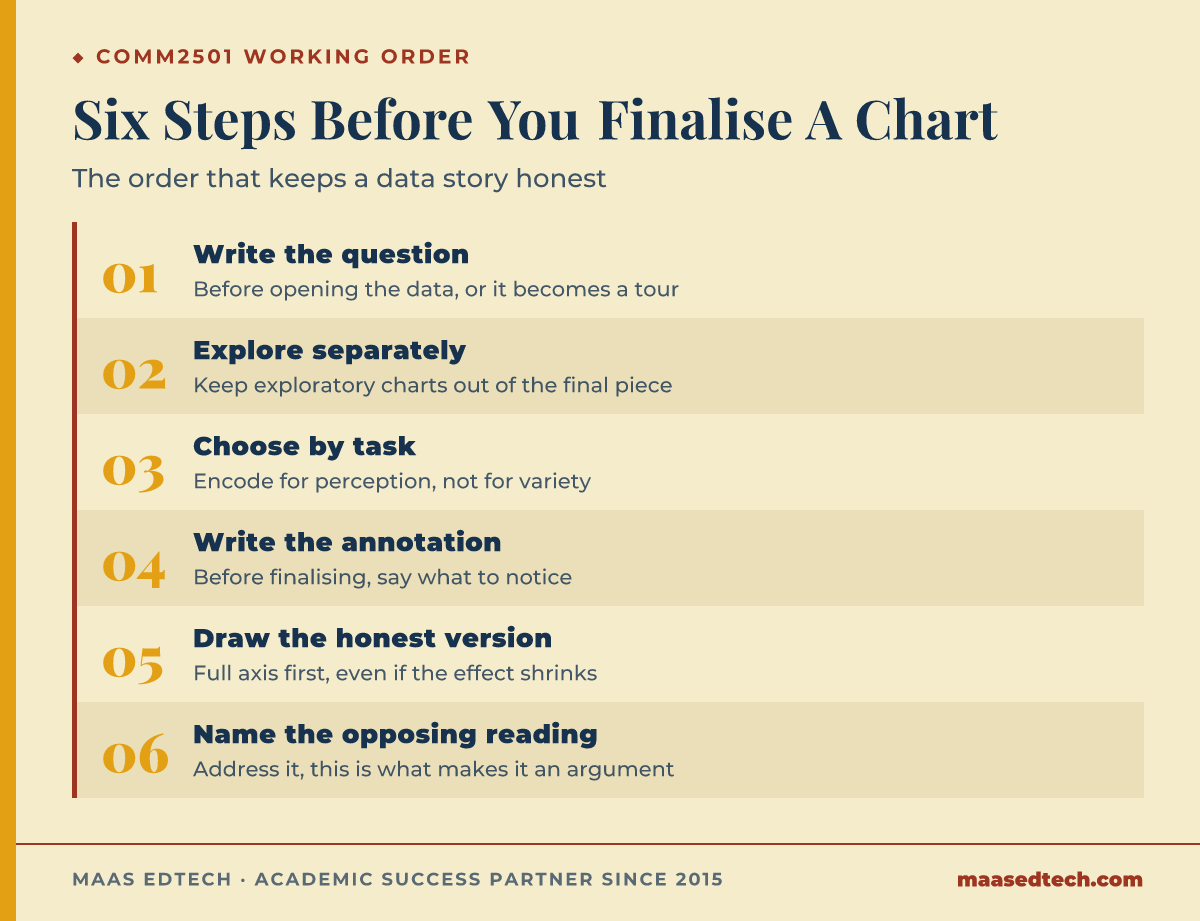
- Write the question before you open the data. A data story with no question becomes a tour of the dataset, the exact failure Knaflic (2015) tries to rule out with her "big idea" test.
- Explore first and separately. Keep exploratory charts out of the final piece; they were built to inform you, not the reader, the same split Segel and Heer (2010) describe between analysis and presentation.
- Choose encodings by perceptual task, not by variety. If the reader needs to compare values, give them position on a common scale, the ordering Cleveland and McGill (1984) and Ware (2013) both defend.
- Write the annotation before you finalise the chart. If you cannot say what the reader should notice, the chart is not finished.
- Draw the honest version first. If the effect disappears at a full axis, that is a finding about the effect, not a problem with the axis, the disclosure test Cairo (2019) and Tufte (1983) both apply to axis manipulation.
- Name the strongest opposing reading of your data and address it. This is what converts a presentation into an argument.
Frequently asked questions
Do I need programming experience before this course?
The course teaches the tools, and students without a coding background do fine, but budget time in the first weeks for the mechanics so that the software stops competing with the thinking later on.
Is a more complex visualisation better?
No. Complexity is only justified when the question requires it. Interactivity in particular should be added because a reader needs to ask their own follow-up question, not because it is available. Cognitive load is not free either: Miller (1956) put the limit plainly, "Everybody knows that there is a finite span of immediate memory and that for a lot of different kinds of test materials this span is about seven items in length" (Miller, 1956, p. 91), which is one reason a dashboard with twelve linked filters asks more of a reader than a static chart with three.
Can I truncate an axis?
There are legitimate cases, and the test is whether the truncation helps the reader see something real or manufactures an impression the data does not support, the same test Cairo (2019) and Tufte (1983) apply to axis manipulation. If you truncate, say so in the chart and give the reader the base.
How do I handle a dataset that does not support my argument?
Change the argument. This sounds obvious and it is the single most common place where student data stories go wrong, because the narrative gets fixed before the analysis finishes.
Should I cite visualisation literature in an analytics assignment?
Follow your course outline. Where it is appropriate, a design choice justified by perceptual research, Cleveland and McGill (1984) for encoding, Knaflic (2015) for structure, is far stronger than one justified by preference, and it takes one sentence.
How long should the written narrative be?
Assignments built around a data story commonly run 1,500 to 2,500 words for the written narrative, separate from the charts themselves, though the exact figure always sits in your own course outline rather than in a general rule, the same caveat Munzner (2014) and Few (2006) both attach to any word count they mention.
Where MAAS fits
MAAS mentors work alongside students on courses like this rather than in place of them. On a data story, the most useful review is usually a hostile reading: what would a person who disagreed with your conclusion say about this chart, this axis, this omitted year. Work that has survived that reading tends to be simpler than work that has not, because the decorative parts do not survive the question. The analysis stays yours. If that is useful, our academic support service and our data and coding projects service are the two places to start.
References
Bertin, J. (1967). Sémiologie graphique: Les diagrammes, les réseaux, les cartes. Mouton/Gauthier-Villars.
Cairo, A. (2019). How charts lie: Getting smarter about visual information. W. W. Norton & Company.
Cleveland, W. S., & McGill, R. (1984). Graphical perception: Theory, experimentation, and application to the development of graphical methods. Journal of the American Statistical Association, 79(387), 531–554. https://doi.org/10.1080/01621459.1984.10478080
Few, S. (2006). Information dashboard design: The effective visual communication of data. O'Reilly Media.
Huff, D. (1954). How to lie with statistics. W. W. Norton & Company.
Knaflic, C. N. (2015). Storytelling with data: A data visualization guide for business professionals. Wiley.
Kosara, R., & Mackinlay, J. (2013). Storytelling: The next step for visualization. Computer, 46(5), 44–50. https://doi.org/10.1109/MC.2013.36
Miller, G. A. (1956). The magical number seven, plus or minus two: Some limits on our capacity for processing information. Psychological Review, 63(2), 81–97. https://doi.org/10.1037/h0043158
Munzner, T. (2014). Visualization analysis and design. CRC Press.
Pandey, A. V., Rall, K., Satterthwaite, M. L., Nov, O., & Bertini, E. (2015). How deceptive are deceptive visualizations? An empirical analysis of common distortion techniques. In Proceedings of the 33rd Annual ACM Conference on Human Factors in Computing Systems (pp. 1469–1478). ACM. https://doi.org/10.1145/2702123.2702608
Segel, E., & Heer, J. (2010). Narrative visualization: Telling stories with data. IEEE Transactions on Visualization and Computer Graphics, 16(6), 1139–1148. https://doi.org/10.1109/TVCG.2010.179
Stolte, C., Tang, D., & Hanrahan, P. (2002). Polaris: A system for query, analysis, and visualization of multidimensional relational databases. IEEE Transactions on Visualization and Computer Graphics, 8(1), 52–65. https://doi.org/10.1109/2945.981851
Tufte, E. R. (1983). The visual display of quantitative information. Graphics Press.
Ware, C. (2013). Information visualization: Perception for design (3rd ed.). Morgan Kaufmann.
Wickham, H. (2010). A layered grammar of graphics. Journal of Computational and Graphical Statistics, 19(1), 3–28. https://doi.org/10.1198/jcgs.2009.07098
Wilkinson, L. (2005). The grammar of graphics (2nd ed.). Springer.
Yau, N. (2011). Visualize this: The FlowingData guide to design, visualization, and statistics. Wiley.
Tools & resources
UNSW Sydney. (2025). COMM2501: Data Visualisation and Communication. https://handbook.unsw.edu.au/undergraduate/courses/2025/COMM2501